Instagram is trying a new layout that spotlights Reels and DMs with their own tabs, and it’s optional for now. The test lines up with Meta’s focus on short video and private messaging, which it says have driven most of Instagram’s recent growth. (Engadget)
Background
Adam Mosseri, Instagram’s head, said some users can opt in to a new menu bar that rearranges core tabs to elevate Reels and DMs, with swipeable navigation between sections. Earlier trials in India made Reels the default tab and put DMs second, showing where the app is headed globally if tests go well. (The Verge)
How it works
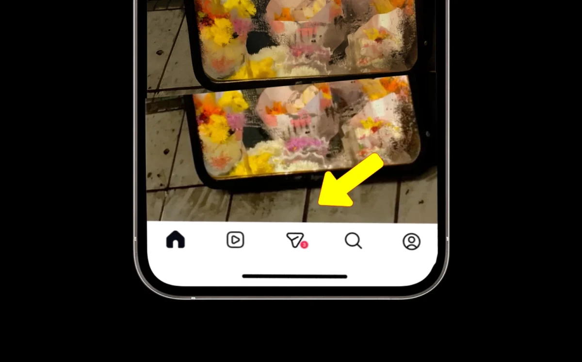
- The new menu swaps Reels and Search, and replaces the “create post” button with a dedicated DMs tab.
- Testers can swipe between tabs for faster, more fluid navigation across the app.
Key points
- The layout is optional during testing to let people adjust at their own pace.
- Reels and DMs are highlighted because they’re the fastest-growing features, according to Mosseri.
- A similar Reels-first design has been tested in India, with Reels as default and DMs second.
Why it matters
- The shift reflects how people now use Instagram: watch short videos and share privately in chats.
- It could reduce friction for creators and viewers who rely on Reels and messages to connect and grow.
Impact / Expert View
This test moves Instagram further from its photo-first roots toward a video-forward experience that promotes private sharing, which may please Reels fans but disappoint photo purists. If engagement and satisfaction stay strong, the layout could expand beyond early markets like India to a wider rollout.
Conclusion
Instagram’s experiment puts Reels and DMs in the spotlight, matching how people already use the app today—short video first, chat second. Would this layout make scrolling and messaging feel faster day to day?
Last Updated on October 18, 2025 by Lucy